


Transbagé | Brand Identity
SOBRE / About
-
Transbagé é uma empresa de transporte e logística que atua há 16 anos em Foz do Iguaçu/PR trabalhando exclusivamente com aço e atendendo importadoras e exportadoras na tríplice fronteira. Em 2016 a empresa iniciou um projeto de expansão buscando fortalecer sua identidade nos países que atua, reforçando sua origem e se posicionando como uma empresa internacional.
Transbagé is a transport and logistics enterprise that has been operating for 16 years in Foz do Iguaçu/Brazil working exclusively with steel and serving importers and exporters in the Triple Border (Brazil, Argentina and Paraguay). In 2016 the company starts an expansion project seeking to strengthen its identity in the countries its operates, reinforcing its origin and positioning itself as an international company.

A SOLUÇÃO / The solution
-
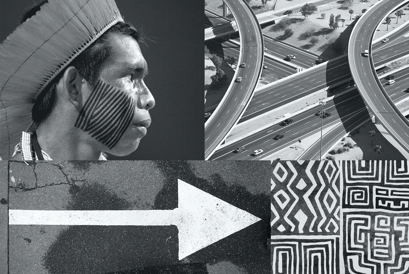
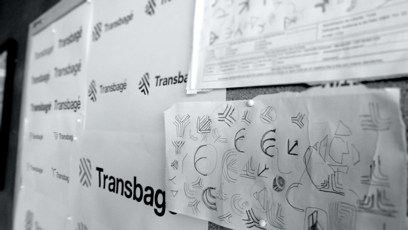
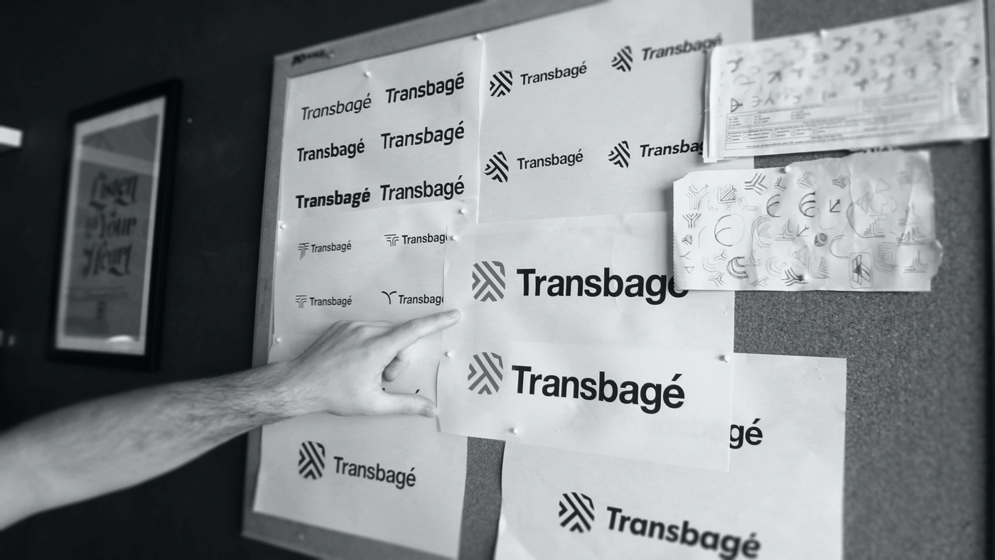
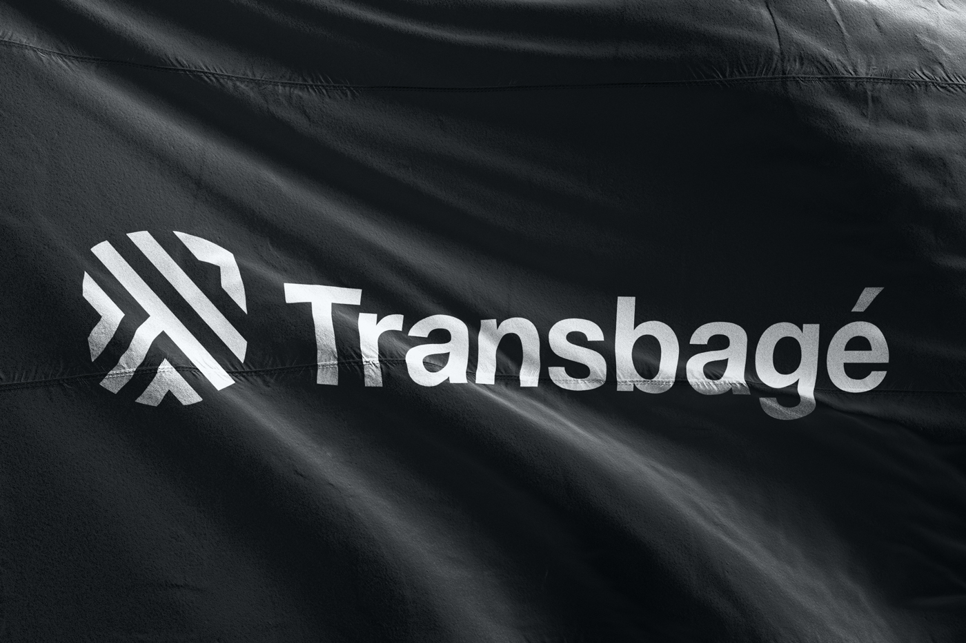
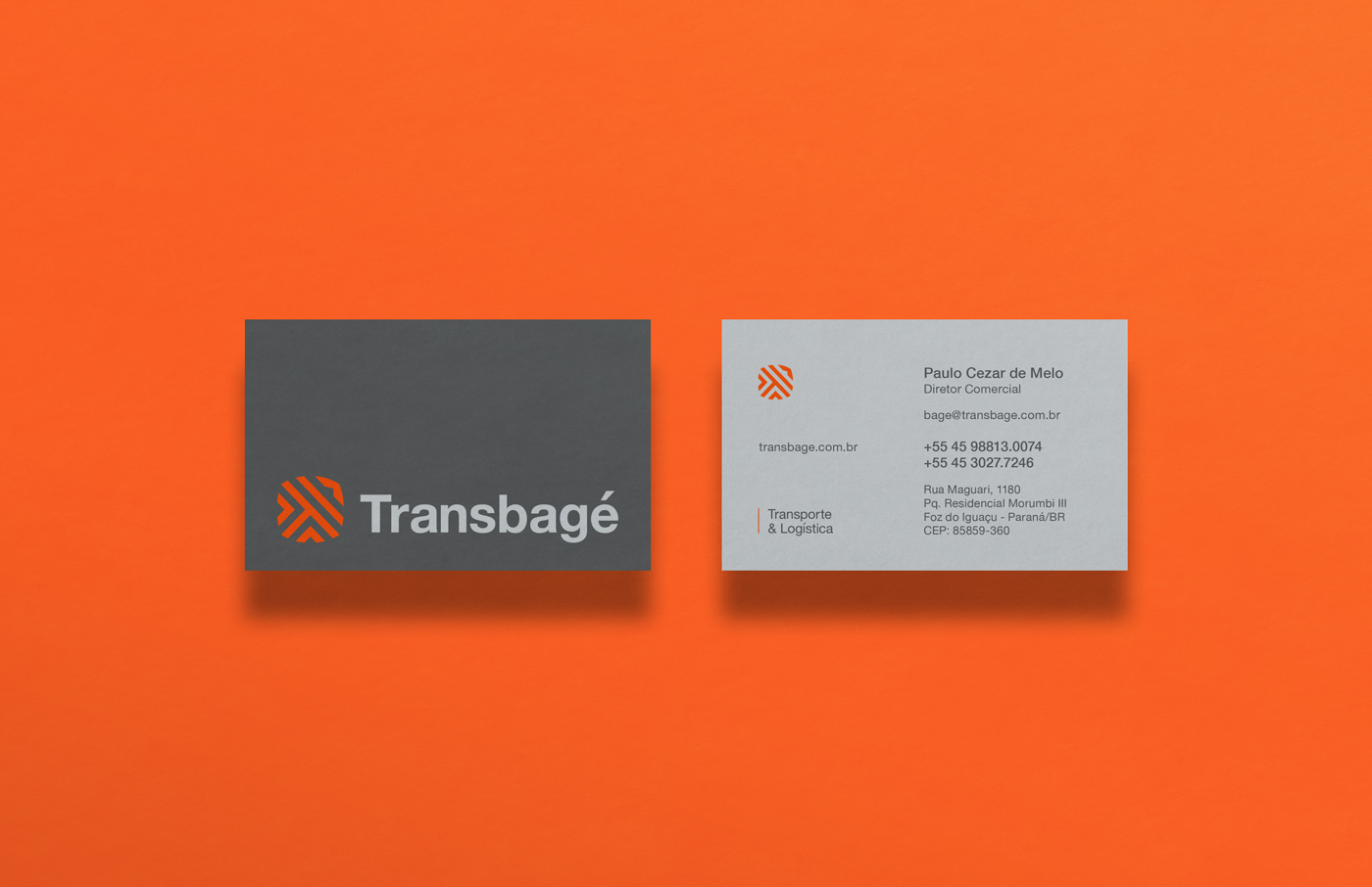
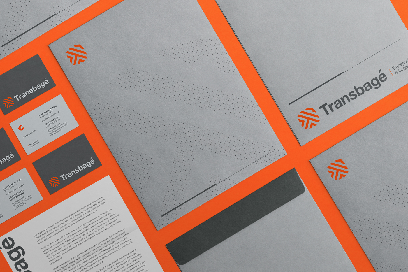
A solução visual remete as raízes da empresa, seu nome e sua região. O termo "Bagé" tem origem indígena e é utilizado por povos Tupí-Guarani e Charrua, ambos nativos da região sul do Brasil. A identidade traz à tona esta referência que já era presente na marca porém não explorada. Abraçar essa temática é uma ótima maneira de criar personalidade própria e reforçar uma identidade local. Além disso é algo que faz muito sentido quando falamos de América Latina, em grande parte influenciada pela cultura indígena, tendo apelo nos três países de atuação da empresa.
The visual solution refers to the roots of the company, its name and its location. The origin of term “Bagé” is indigenous used by Tupi-Guarani and Charrua people, both native of southern Brazil. The identity brings out this reference that was already present in the brand but not exploited. Embrace this theme is a great way to create personality and reinforce the local identity. It is also something that makes a lot of sense when it comes to Latin America, which is largely influenced by the indigenous culture, having appeal in the three countries where the company operates.

No primeiro destaque a tríplice fronteira, no segundo setas que indicam a direção e na última a flecha fazendo referência a cultura indígena. In the first symbol is possible to find the triple frontier, in the second an arrow indicating the direction and in the last an native arrow making reference to the indigenous culture.


CRÉDITOS
-
Design: Guilherme Mazzo
Atendimento: Hayane Issa
MENÇÕES:
-


